Gutenberg’s Inventions – Part 3: Type and Type Case
In our series, guest author Dr Julia Bangert from the International Gutenberg Society in Mainz e.V. is gradually introducing the inventions of Johannes Gutenberg. The third part deals with type and the type case.
The Type
The typefaces, or printing type, are mainly made of lead and are the result of casting using a hand-operated casting mould. At the top of a long rectangular body (type size), each letter bears the reversed and raised image of a character. Together, individual letters form a typeface with which a wide variety of texts can be set.
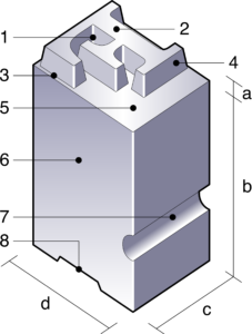
To save time, scribes in the early modern period frequently used abbreviations and letter combinations known as ligatures. Johannes Gutenberg modelled his prints closely on the style of handwriting and adopted these characteristics. Instead of setting his texts using only the 26 letters of the alphabet in upper and lower case, along with punctuation marks – as is customary today – he also produced a whole range of these special characters. In addition, there were various variants of a letter, for example as a connecting letter. Such a connecting letter appeared to be cut off on its right-hand side and had no serif, so that a following letter could be set close against it. In total, Gutenberg cast around 290 different typefaces for his famous Gutenberg Bible.
The type case
The finished type was arranged in a wooden box with many small compartments of varying sizes, known as the ‘type case’. We do not know whether Gutenberg already used such a type case or arranged the type in some other way. In a manual typesetting workshop, the type case is, in any event, an integral part of the equipment. There is a separate type case for every typeface, size and style. The size of the individual compartments and the arrangement of the type within them are determined by practical considerations. The letters or punctuation marks used most frequently are placed in the largest compartments in the centre. This allows more of them to be accommodated in the type case and makes them easiest for the typesetter to reach. Less frequently used characters are found in the smaller compartments around the edges. In addition, every type case also contains non-printing material, known as ‘blank material’, for spaces between words and character spacing.
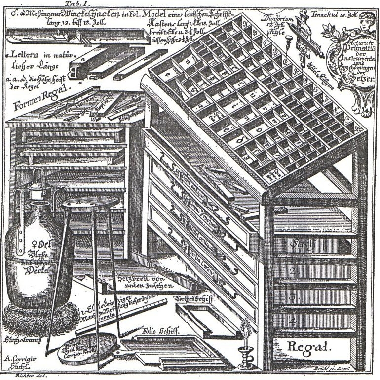
Christian F. Gessner, “The Art of Printing and Typefounding: Both Necessary and Useful, Illustrated with its Typefaces, Formats and All Associated Instruments, Clearly Described, and Accompanied by a Concise Account of the Origin and Development of the Art of Printing”, 1740, p. 226f
FAQ – Frequently Asked Questions
Typefaces, or printing type, are small metal characters bearing, at the top, a reversed and raised image of a letter, punctuation mark or special character. They can be assembled to form different texts and reused.
Gutenberg’s type was mainly made of lead. It was produced using the hand-casting tool, which is explained in a previous section of the ‘Gutenberg’s Inventions’ series.
Around 290 different letters were cast for the Gutenberg Bible. In addition to upper- and lower-case letters, these included abbreviations, ligatures and various letter variants.
A type case is a wooden box with many compartments of different sizes for storing type. Frequently used letters are stored in larger, easily accessible compartments. The type case also contains filler material for spaces between words and character spacing.

About the author:
Julia Bangert holds a Ph.D. in Book Studies and is an artist. In 2019, her dissertation was published under the title 'Book Trade System and Knowledge Space in the Early Modern Period.' She works freelance as a book painter and illustrator. Her signature style features the finest use of color and an elegant brushstroke, with perfect gold leafing as her passion.
One of her ongoing projects is the illumination of Bible pages, which can be purchased in the shop at the Gutenberg Museum in Mainz.

